Using the Color Wheel for Friendship Bracelets
Learn how complementary, analogous and triadic schemes from the color wheel translate into floss choices, why light-dark contrast matters on a narrow band, and how one neutral string ties a palette together.

The color wheel for friendship bracelets is the same tool painters and designers use, applied to a strip of knots less than an inch wide. It will not choose your floss for you, but it explains why some strings spark against each other and others melt together, and it gives you three dependable recipes to start from. Add an understanding of contrast and one neutral string, and picking colors stops being guesswork.
How the color wheel is laid out
The traditional color wheel arranges hues in a circle. Red, yellow and blue sit an equal distance apart. Between them come the mixes: orange between red and yellow, green between yellow and blue, violet between blue and red. Further in-between hues such as teal, lime, coral and magenta fill the remaining gaps.
Two facts about the circle do most of the work:
- Neighbors agree. Colors that sit side by side share an ingredient, so they blend calmly.
- Opposites argue. Colors across the circle share nothing, so each makes the other look stronger.
One half of the wheel, from red through orange to yellow, is called warm. The other half, from green through blue to violet, is called cool. Warm colors seem to come forward and cool colors seem to sit back, which is useful when deciding which string should be the star.
Complementary: maximum energy
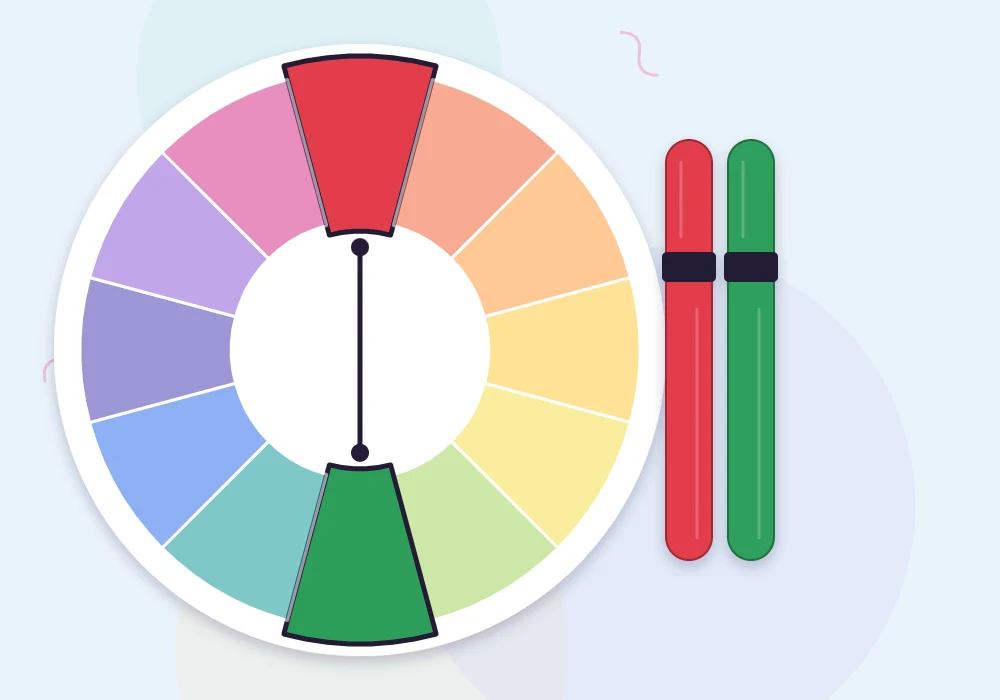
A complementary scheme uses two colors from opposite sides of the wheel: blue with orange, red with green, yellow with violet. On a bracelet this gives the sharpest possible pattern, which is ideal when you want a chevron or diamond to be visible from across a room.
Used in equal amounts, opposites can vibrate uncomfortably. Tame them in one of these ways:
- Let one color lead and use the other as a thin accent stripe.
- Change the lightness of one side: navy with peach is gentler than cobalt with tangerine.
- Put a neutral string between them.
Analogous: calm and blended
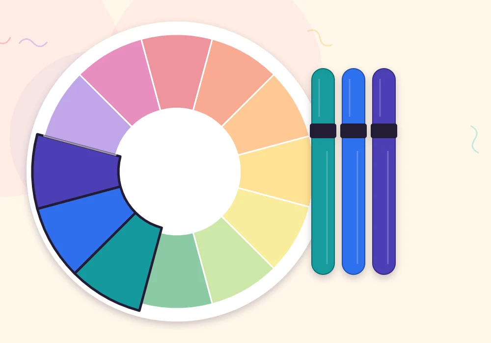
An analogous scheme takes three or four neighbors: teal, aqua and sky; or coral, tangerine and sun. Nothing clashes, so these palettes are hard to get wrong. The risk is the opposite one: with too little difference between strings, the pattern disappears into a single soft band.
To keep an analogous bracelet readable, vary the lightness as well as the hue. Forest, teal and mint are neighbors on the wheel but clearly dark, medium and light. Taken further, this becomes a gradient, and the ombre friendship bracelet guide explains how to order the shades.
Triadic: balanced and playful
A triadic scheme uses three colors spaced evenly around the wheel, forming a triangle. Red, yellow and blue is the best-known triad; orange, green and violet is another; coral, lime and indigo is a less expected one. Triads feel lively and balanced at once, because every color has two contrasting partners.
At full strength in equal amounts, a triad can look like a toy box. Choose one color for most of the strings, a second for support, and use the third on just one or two strings. Softening all three, such as blush, lemon and sky instead of red, yellow and blue, gives a gentler result with the same balance.
Contrast matters more than hue
The wheel shows hue only. On a narrow bracelet, the difference between light and dark often matters more. A medium green and a medium red are opposites on the wheel, yet from a few feet away they can blur into a brownish band because they are equally dark.
A quick test: lay your strings together and squint, or take a photo and switch it to black and white. If you can still count the separate strings, the pattern will show. If two of them merge into one gray, lighten or darken one of them.
Watch out
Yellow is naturally light and violet is naturally dark, so that pair almost always has good contrast. Red and green, or blue and orange, are much closer in darkness. With those pairs, deliberately pick a pale version of one and a deep version of the other.
Adding a neutral
White, cream, sand, silver gray, charcoal and cocoa brown do not belong to any slice of the wheel, so they fit with every scheme. One neutral string does a lot:
| Neutral | Effect on the bracelet | Good with |
|---|---|---|
| White | Sharpens edges, makes brights look brighter | Complementary and triadic schemes |
| Cream or sand | Softens and warms the palette | Warm analogous schemes, earthy colors |
| Silver gray | Cools and calms without the starkness of white | Blues, violets, pastels |
| Charcoal or navy | Outlines shapes, makes light colors glow | Brights, diamonds and alpha motifs |

Tip
In a mirrored pattern, put the neutral on the outer strings. It frames the bracelet with a clean edge and keeps the strongest colors in the middle, where the eye lands first.
From scheme to strings
A short routine turns the theory into a set of cut strings:
- Pick the one color you most want to wear. That is your leader.
- Choose a scheme: its opposite for punch, its neighbors for calm, or its triangle partners for play.
- Add one neutral.
- Run the squint test and adjust lightness until every string stands apart.
- Decide the order. In a chevron bracelet, the order of the strings is the order of the V stripes, so place the strongest contrast side by side.
If you would rather begin from finished recipes than from the wheel, the list of friendship bracelet color combinations has eight ready-made palettes that follow these same rules.
Frequently asked questions
What are complementary colors on a friendship bracelet?
They are two colors from opposite sides of the color wheel, such as blue and orange or yellow and violet. They give the strongest contrast, so patterns show up clearly.
Which color scheme is easiest for beginners?
Analogous schemes, which use neighboring colors, are the hardest to get wrong. Just make sure the strings differ in lightness so the pattern stays visible.
Do black and white count as colors on the wheel?
No. White, gray, black and browns are neutrals that sit outside the wheel, which is why they work with any scheme.
Why do my colors look muddy once the bracelet is knotted?
The strings are probably too similar in darkness. Squint at them or view a black-and-white photo, then swap one for a lighter or darker shade.