Friendship Bracelet Color Combinations: 8 Original Palettes
Eight original color combinations for friendship bracelets, each with three to five floss colors, a mood and the pattern that suits it, plus simple rules for building your own palettes.
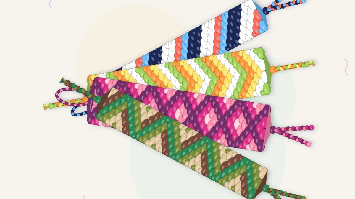
Choosing friendship bracelet color combinations is often harder than tying the knots. A wall of embroidery floss offers hundreds of shades, and three that look lovely as skeins can turn muddy once they are knotted side by side. The eight palettes below are original mixes of three to five colors, each with a note on the pattern that shows it off, followed by a simple way to build combinations of your own.
What makes a color combination work
A bracelet is a narrow strip seen from arm’s length, so subtle differences disappear. Three things decide whether a palette reads clearly at that size:
- Light and dark. At least one color should be clearly lighter and one clearly darker than the rest. This matters more than the hues themselves.
- One leader. Pick a single color to carry the bracelet and let the others support it. Four equally loud colors compete with each other.
- A place to rest. White, cream, sand, gray or charcoal gives the eye a break and makes the neighbors look brighter.
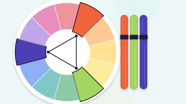
If you want the reasoning behind why certain hues flatter each other, the guide to using the color wheel for bracelets covers complementary, analogous and triadic schemes in detail.
Eight original color combinations
Each palette is listed darkest or strongest color first. Shade names are descriptive rather than tied to any floss numbering system, so match them by eye at the store.
| Name | Colors | Mood | Best pattern |
|---|---|---|---|
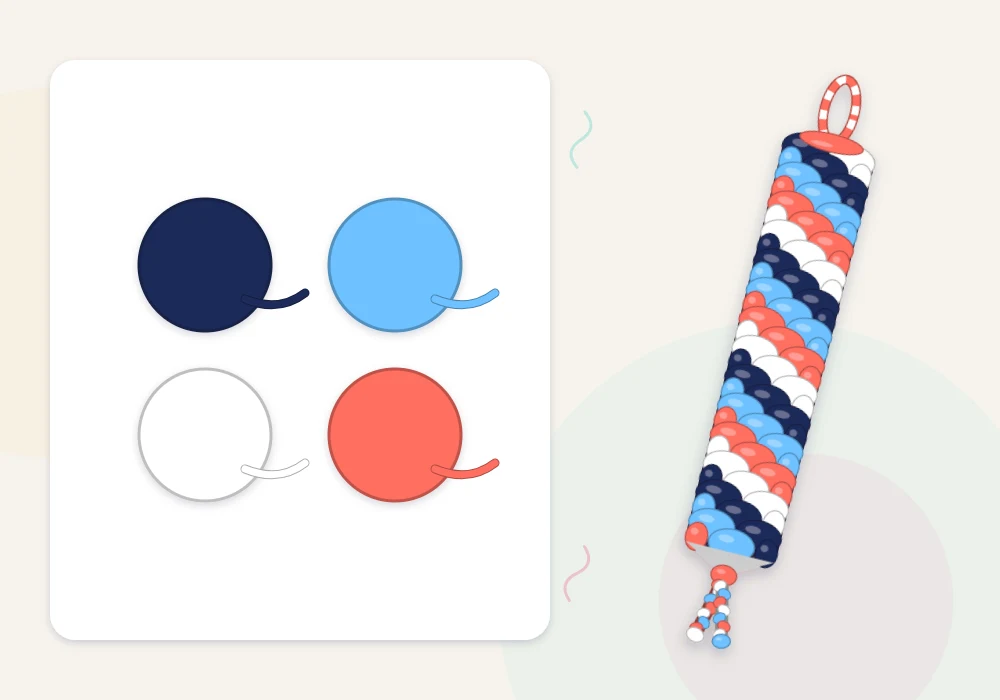
| Harbor Morning | Navy, sky blue, white, coral | Crisp and nautical | Candy stripe |
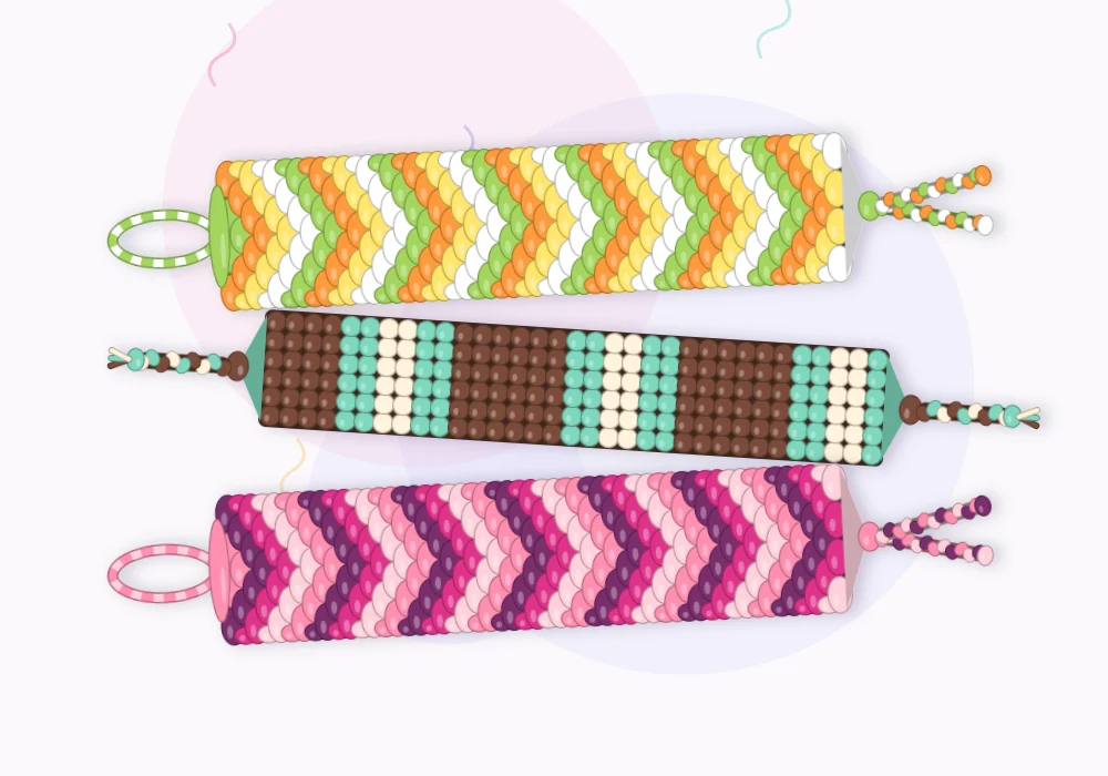
| Citrus Stand | Tangerine, lemon, lime, white | Loud and sunny | Chevron |
| Desert Dusk | Burgundy, coral, peach, sand | Warm and soft | Chevron or diamond |
| Mint Chip | Cocoa brown, mint, cream | Calm, a little retro | Horizontal stripes |
| Berry Patch | Plum, magenta, rose, blush | Rich and romantic | Wide chevron |
| Night Market | Charcoal, teal, magenta, gold | Dark with bright sparks | Diamond |
| Forest Floor | Forest green, olive, cocoa, sand | Earthy and muted | Zigzag |
| Tide Pool | Navy, teal, aqua, mint, cream | Cool and watery | Candy stripe or braid |
Matching the palette to the pattern
The same four colors behave differently depending on how the knots are arranged.
Diagonal stripes
In a candy stripe bracelet every color touches the one before and after it in the string order, and the last color wraps around to meet the first. Put your lightest and darkest strings next to each other for sharp lines, or separate two similar colors with a neutral so they do not merge. Harbor Morning works well here because white sits between the blues and the coral.
Chevrons and diamonds
A classic chevron repeats its colors as a stack of V shapes, so palettes with a clear order look best: light to dark, or warm to cool. Berry Patch and Desert Dusk both step evenly from one end to the other. Diamonds enclose a small center, which is the ideal spot for a single bright accent such as the gold in Night Market.
Braids and horizontal stripes
Braids mix their strands closely, so three colors are plenty and strong contrast helps the plait stand out. Horizontal stripes show each color as a solid band, which suits quiet palettes such as Mint Chip where the proportions do the talking.
How many strings of each color
Equal amounts of every color give an even, cheerful rhythm. Uneven amounts usually look more deliberate. A useful starting split for a six- to eight-string bracelet is:
- the leader color on about half the strings,
- a supporting color on about a third,
- one or two strings of the accent.
For Night Market on eight strings, that could be four charcoal, two teal, one magenta and one gold. Placing two strings of the same color side by side doubles the width of that stripe, which is the easiest way to make a leader color feel dominant.
Tip
Before cutting, pull a few inches from each skein and twist the strands together between your fingers. The twist mixes the colors the way knots will. If one shade vanishes, swap it for something lighter or darker.
Adjusting a palette that is not working
Small swaps fix most problems without starting from scratch:
- Looks flat: replace one mid-tone with white or cream.
- Looks harsh: trade pure white for cream or sand, or black for charcoal or navy.
- Looks childish: drop one bright color and add a dark neutral.
- Looks dull: add a single string of an unexpected accent, such as coral with blues or gold with purples.
Another reliable route is to stay inside one color family and vary only the lightness. That gives a gradient rather than a contrast palette, which is covered in the ombre bracelet guide.
Watch out
Two colors of similar darkness, such as medium blue and medium purple, blur into one stripe from a short distance even though they look different in the skein. Squint at your strings: if two of them merge, separate them or change one.
Keeping track of palettes you like
Wind a short length of each color around a strip of card, in the order you plan to string them, and write the palette name on the back. A small stack of these cards becomes a personal reference: you can see at a glance which mixes you have tried, compare new skeins against them in the store, and repeat a favorite combination later without guessing which shade of teal it was.
Frequently asked questions
How many colors should a friendship bracelet have?
Three to five colors is the easiest range to balance. Fewer than three can look plain in a striped pattern, and more than five tends to look busy on a narrow band.
What colors go well together on a friendship bracelet?
Combinations with a clear light, a clear dark and one accent work reliably, such as navy, sky blue, white and coral. Colors of similar darkness tend to blur together once knotted.
Should I include white in my bracelet?
A white or cream string makes the other colors look brighter and keeps stripes crisp. Cream or sand is a softer choice and shows dirt less than pure white.
Can I use the same palette for different patterns?
Yes, but the result changes. Diagonal stripes put every color next to its neighbors in the string order, while chevrons stack the colors as repeating V shapes, so the order you string them matters.